The Making of VR: An Inside Look with Developers, Part 1
A deep-dive look into design challenges that come with creating an immersive and comfortable VR experience.

From the moment of its conception, we knew that we wanted Star Wars™: Squadrons to be fully playable in VR. Ever since I was a kid, building cockpit simulators out of wood and scrap metal or going to the arcade to fly X-wings in vector-based graphics simulations, I dreamed of sitting in an authentic Star Wars cockpit and being immersed in one of those epic space battles. As we developed the initial pitch for the game, it was encouraging to see that we weren’t the only ones excited at the prospect; teammates, Motive directors, and EA executives all immediately saw the potential and pledged their support.

As a long-time proponent of VR, and having experience developing independent VR games, I knew Squadrons was an excellent candidate for VR. Great strides had already been made with the Rogue One VR Mission, which was very well received, so we knew that we had the technology and the audience for this to be a success. That said, there’s a lot more to making an engaging VR experience than just rendering a game in a VR headset.
Design Challenges
With VR still in its infancy and not yet widely adopted, making a dedicated VR-only game was not an option. Our game would also need to be entirely playable on conventional screens in order to reach a wider audience. We refused to compromise on the VR aspect, however.
Building on our experience and data from the Star Wars™ Battlefront 2 single-player campaign, we very quickly had functional prototypes of our starfighters, and within a week or two beyond that, we had them flyable in VR. This was an encouraging start, and proved we could make this game without spending years in R&D, but there were still design challenges to overcome.
Diegetic interface
One of our most interesting challenges was designing the starfighter cockpits to be functional, aesthetic, and ergonomic in either the 2D or VR modes (we wanted as little deviation as possible between the two modes for consistency, and to smooth the transition between them). Additionally, every cockpit, especially in the New Republic ships, is totally unique and requires its own design and iteration.
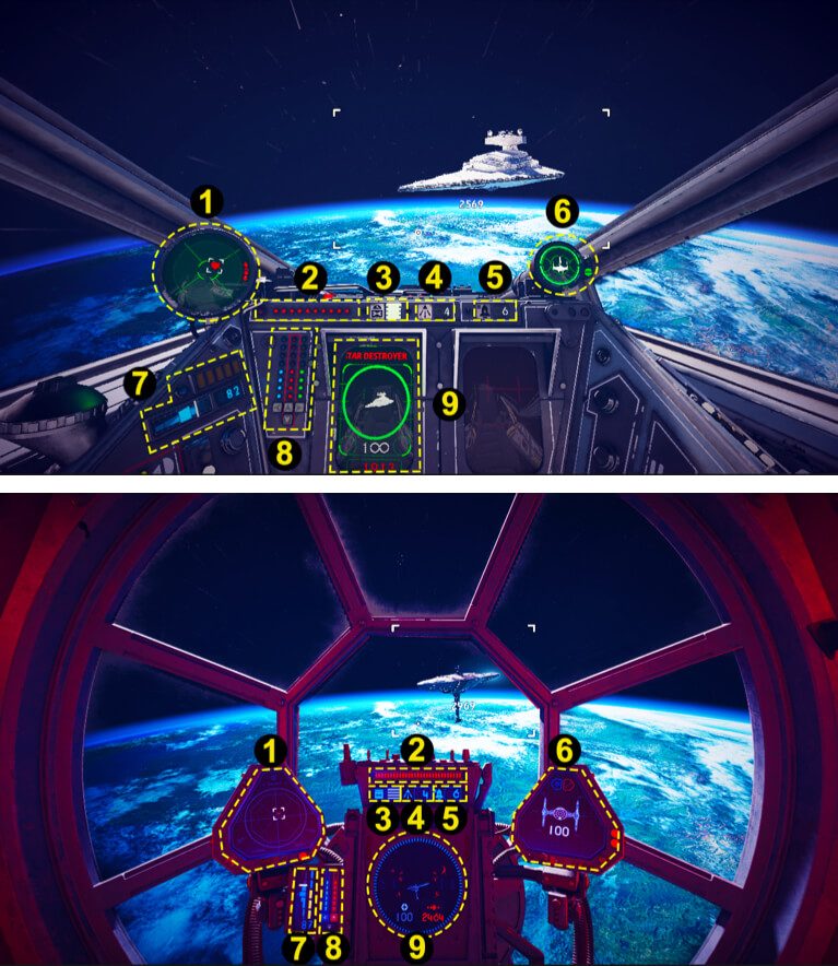
We wanted to make the ultimate Star Wars pilot experience, and since pilots in the films are never seen to be using Heads-Up Displays (HUDs), relying instead on physical instruments and screens on their cockpit dashboards, we were committed to building as much of the critical game feedback (radar, target information, threat indicators, damage feedback, ammo count, speed gauges, etc.) directly into the “physical” components of the cockpit, rather than relying on immersion-breaking UI.The UI counterparts of those components would still exist as an option for more casual players, but could be turned off to better simulate the “authentic” starfighter pilot experience.
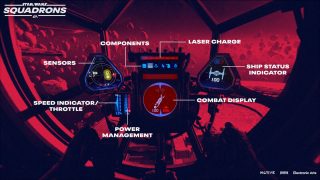
Working in collaboration with concept art, modelling, UX, and animation teams, we designed the configuration of each ship’s cockpit, dashboards, and controls. After much iteration, resizing, repositioning and reshaping the individual components, we managed to fit all of the critical information that a player would need in combat onto display screens, status lights, throttle gauges, and counters that were built into the cockpit models. We also had to fit them within the safe area where someone playing on a conventional 2D screen would have access to all of the required information. Fortunately, this did not compromise the VR experience as it is also beneficial to restrict the important feedback to areas where the player can see them either directly or peripherally, without turning their head.
VR comfort
The increased interest in VR over the past decade has resulted in many key learnings and strategies for mitigating one of the biggest factors preventing its more widespread adoption: VR sickness.This is a condition that many people suffer when experiencing virtual reality, where the discrepancy between the motion perceived in the virtual space, and the motion (or lack thereof) registered by their own bodies, results in a feeling comparable to motion sickness.
For Squadrons, we used a variety of techniques to minimize this effect. First and foremost, we needed to maintain a solid framerate, and this was achieved through a combination of clever optimizations and advanced rendering techniques, which you can learn about in this article. We also had to ensure that the views between left and right eyes were consistent, so any deviations were addressed as quickly as possible by our engineers (eg. seeing shadows in one eye but not the other could be extremely unpleasant for the eyes).
On the design side, we also applied several techniques that contributed to reducing nausea:
- Frame of reference - The cockpit itself provides a frame of reference for the player, which helps anchor their perception in the world and reduce dizziness. We also render “space dust” particles that provide an exterior frame of reference when there are no nearby structures.
- Cockpit shake - Not to be confused with the camera shake that is commonly used in games to accentuate physical impacts and shockwaves from explosions. In VR, camera shake can be very upsetting, as the player’s virtual self is shaken violently, while in reality their body feels nothing, a dissonance that can cause immediate nausea. In Squadrons we never shake the camera, we only shake the cockpit around the camera, which results in a visible representation of damage and shockwaves impacting the ship, but the exterior view is unaffected, which helps ground the player in a stable space. In a sense, the cockpit acts as a shock absorber, displaying the necessary feedback while protecting the player from the unpleasant side effects.

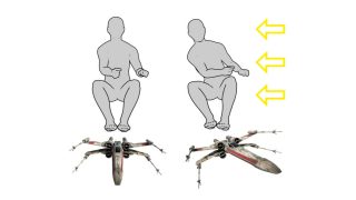
- Inertia simulation - In order to provide a more realistic experience, as well as smooth the sudden changes in direction that can cause disorientation and nausea, we developed an inertia system that visually simulates the g-forces applied to a pilot’s body during flight maneuvers. When the player turns or accelerates/decelerates the ship, the virtual pilot body and eyes will be pushed in the appropriate direction. For example, if the player uses the throttle to increase speed, they will notice that their perspective is pushed slightly toward the rear of the ship, as a real person would while sitting in an accelerating car, or in an airplane during takeoff. Similarly, making a high speed turn to the left will push the player’s perspective to the right, simulating the centrifugal force that you feel when turning a corner at high speed in a car. Cosmetic items like hanging decorations are animated in a similar fashion to reinforce the effect. These techniques help to cushion the effect of sudden acceleration and directional changes so that the discrepancy between what a player sees and what they feel is less jarring.
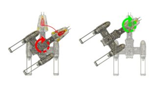
- Ship centering - Another factor that can contribute to VR sickness is rotational offset. While rotation of the ship in VR is already a contributing factor to nausea in some people, it can be exacerbated by any offset between the camera and the center of rotation. For example, a Y-wing starfighter has a cockpit that is at the nose of the ship, well forward of what would normally be the center of mass for a ship of this profile. When a Y-wing pilot turns the ship, logically it should rotate around the center of mass, but this would result in the player being both rotated and displaced at the same time, as if being swung around on the end of a long beam. To address this, we configured each ship so that the rotational pivot is always centered at the default position of the pilot’s eyes. This removes the displacement from the equation and mitigates the discomfort.
- No loss of camera control - Except in very rare cases, we never take camera control away from the player. Even moderate camera movement that is not directly controlled by the player can lead to severe motion sickness, so in Squadrons the player’s VR headset is always the primary controller for the camera. In some short sequences the game may take over control of the ship (during hangar launch, for example), but the player will always be free to turn their virtual head around, and in the case of launches, the player can take immediate control and break out of the scripted sequence.
- No predefined maneuvers - Though they are a popular aspect of some games, we avoided implementing any sort of pre-baked maneuvers, like a button that would trigger a loop or barrel roll, for example. Partly this was to increase the depth of gameplay control, but similar to taking camera control away from the player, these types of moves are extremely unpleasant in VR. Instead, all maneuvers are directly controlled by the player, so that they can accelerate, decelerate, and turn at rates that are directly controlled by their input, so their brain knows exactly what to expect, and they can ease off if they start to feel uncomfortable.
- UI distance - Floating UI is an interesting problem as well. If we simply projected UI elements onto invisible planes inside the cockpit, it could lead to severe eye strain, especially in Squadrons, as the player switches focus from the UI in the cockpit to a target out in space hundreds of meters away. To address this, for some elements like the aiming reticle (which was a necessary concession from immersion even in Instruments Only mode), we project it onto a plane that will automatically snap to the distance of the closest object behind the reticle, and resize itself accordingly so that it always appears to be the same relative size. This is almost imperceptible while playing, but eliminates the subtle eye strain that would otherwise occur when attempting to focus on two objects (the reticle and the target) that are at different distances at the same time.
- UI and cockpit overlap - Another unpleasant effect occurs when the non-diegetic UI elements (UI that is not built into the cockpit geometry) are rendered at a distance that places them behind cockpit geometry. Since these UI elements are rendered on top of any other graphics, regardless of occlusion, this has the disturbing effect of forcing players to focus their eyes on something that is physically behind another object which should be occluding it. This is not something that humans encounter in reality, so it can be mildly disturbing as well as introduce eye strain as the player’s eyes try to focus on two overlapping objects at different distances. To address this, we simply ensure all non-diegetic UI fits inside the cockpit and doesn’t intersect any of the geometry. In Squadrons this meant creating a unique UI projection layout for each ship’s cockpit.
- Body dissonance - For further immersion, as well as to reduce body dissonance that can contribute to VR sickness, we provided a pilot body that forms a bridge between the ship and the VR camera. The upper body is driven by the player’s head movements, while the lower body is anchored to the ship, and the hands are driven by controller inputs. This means that when you move your head and look down, you see your virtual body where you’d expect it to be in real life, and when you interact with the controller, you see the virtual hands interacting with the cockpit appropriately.When this is poorly implemented, or when the pilot avatar is omitted entirely, it can lead to body dissonance which can be unsettling for some people.
- Camera fade - Since we can’t physically prevent players from moving their heads through cockpit geometry, which can cause discomfort for some people and reveal graphic artifacts, we smoothly fade the camera to black if the player’s head moves outside of the cockpit space or intersects interior surfaces.
- Restricted movement - When the player has exited the starfighter after boarding a capital ship, they have access to the hangar and the briefing room, which are there primarily for storytelling, mission briefings, and ship customization. Besides the additional development cost of recreating additional detailed interiors, first-person movement (as implemented in most FPS games) is a common cause of VR sickness, and so we decided not to invest in developing other areas of the ship to explore, and focused on maximizing the level of detail and the overall experience while standing in predefined positions around these two spaces.
Exclusive first-person perspective
Some have wondered why we only provided a first-person perspective view. While some players prefer a third-person exterior camera for flight combat games, a real-world pilot doesn’t typically fly their vessel from a position floating several meters behind it, so this ran counter to our goal of creating a fully immersive, Star Wars pilot experience. From a balancing perspective, since 3P permits a wider view of the space around the player’s ship, it would give an unfair advantage to those players willing to sacrifice immersion for a competitive edge. This is a common problem in games that offer both options, which forces players to play in 3P in order to remain competitive, who otherwise would prefer to play from a more realistic viewpoint.
Input
Control input across all supported peripherals was critical for Squadrons. Preventing any one controller type from having a distinct advantage over the others was a constant balancing act, and drove many of our choices about button mapping and control schemes.We had to make sure players could perform the same maneuvers, regardless of whether their preferred controller was a gamepad, joystick, HOTAS, or mouse and keyboard.
Since you can’t see your controller while immersed in VR, we also needed to make the controls as intuitive and simple as possible, which was a challenge considering the depth of control we wanted to provide. Wherever possible, we tried to make the controls mimic what the player sees in VR, so for example, if the throttle control for the ship is on the left, then by default the throttle control on the gamepad is mapped to the left stick. Similarly, cockpit readouts for primary and secondary weapons are placed on the same sides of the dashboard as they are on the controller. Of course the player is always free to use a different preset control scheme or remap the buttons however they like, but for players that are new to space combat simulations, we hoped this strategy would make learning the controls slightly more intuitive.
HOTAS support was a wishlist feature that we definitely wanted regardless of mode, but they are particularly well-suited for VR. They generally have more inputs, which can be navigated by touch, so they don’t have to rely on buttons serving multiple purposes or complex button combinations. They are also meant to increase immersion in flight sims, so that when combined with VR, the players get an even more complete pilot experience.

Tracked controllers were also considered early in production. As they have fewer inputs, and since the gestures which normally compensate for this are slower to execute and less precise than button and stick inputs, we could not devise a control scheme that would be competitive against the other controller types, which would render them essentially unusable in online matches. Though we would have loved to provide the option anyway, ultimately the development time and cost greatly outweighed the benefit to the game and the relatively small audience, so we reluctantly cut the feature.
3D audio
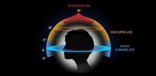
Audio is another factor that can greatly increase immersion in VR. Our audio team put tremendous effort into ensuring that the cockpit experience was totally convincing. All of the sound effect emitters were positioned at their in-game sources; engine roar comes from the rear of the ship, laser blast effects follow the trajectory of the projectiles, damage sounds come from the direction of impact, your droid bleeps at you from it’s position above and behind your head, etc. The starfighter chassis creaks and groans with excessive speed and maneuvers. Close fly-bys of large structures and flying through tunnels reflect the sounds of your engines back at you appropriately. TIE fighters roar past your cockpit with the expected doppler effect. Binaural audio techniques were implemented to maximize the 3D positional audio effect, even when wearing headphones. All of this contributed to an authentic audio environment that greatly amplified the VR experience.
Testing and feedback
Testing the game, especially at the start of production, presented its own challenges. VR has a tendency to provoke nausea in some people, particularly in first-person action games. As part of our iterative process, we scheduled regular play sessions where the team could play together and provide feedback. Our first play sessions left some team members reeling, to the extent that we started providing anti-nausea remedies for the more susceptible players. As we researched mitigating techniques and performance improved, the effects became much less evident, and more players were able to enjoy the experience.

Conclusion
Star Wars™: Squadrons was the culmination of a lifelong dream to insert myself into the Star Wars universe in the most realistic way possible. The technology had finally caught up to that ambition and allowed a group of motivated developers to provide the means for others to live out that fantasy in a galaxy far, far away. Judging by the response we’ve received from fans, many of them claiming that Squadrons has fulfilled similar childhood dreams, and the encouraging ratio of players who have experienced it in VR, I believe we’ve achieved some success. As an advocate for VR, I also hope that it has in some way contributed to more widespread adoption of the technology, and that we can look forward to seeing more games and other applications taking advantage of its tremendous potential.
“Lucasfilm, the Lucasfilm logo, STAR WARS and related properties are trademarks and/or copyrights, in the United States and other countries, of Lucasfilm Ltd. and/or its affiliates. © & ™ 2021 Lucasfilm Ltd. All rights reserved.”
About the Author

James Clement
In addition to pitching the initial concept for Star Wars™: Squadrons, James served as both Lead Gameplay Designer and Technical Design Director on the game. He is an avid VR enthusiast and lifelong Star Wars fan, and you can chat with James about these and other topics on Twitter at @DarthDisembowel, or find him cosplaying at Star Wars Celebration.

